Reviews for Improved L4D1 Loadscreens

Write Review
    • marchie
      marchie

      Posted this review

      10

      Pros:

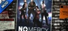
      Posters now looks way better, than Valve's
      HD pictures
      Backgrounds for pictures are awesome choosen (for example, Death Toll's black/grey wall looks nice with this poster)

      Cons:

      Blood Harvest should be on white wall, where now is hanging Dark Carnival's poster (if you look carefuly, you can see, that behind DC poster's is a piece of BH poster)
      Dead Air is behind the Dead Center poster's
      Death Toll is behind the Hard Rain poster's

      Conclusion:

      As you can see, there is 3 cons, but really I don't care. Your work deserves 10/10 and these 3 posters are placed nice. Thanks
    • DXZ
      DXZ
      DXZ

      Posted this review

      9.3

      Pros:

      No Mercy, Crash Course and Death Toll are great improvements.

      Cons:

      Dead Air and Blood Harvest's picture are not in the centre of the screen. Dead Air's back ground is plain.

      Conclusion:

      Make a better back ground for Dead Air.
    • Vince Lionheart
      Vince Lionheart

      Posted this review

      10

      Pros:

      +Way more realistic than default loading screens
      +Made with detail and suits l4d gameplay atmosphere
      +Last poster looks eerie o.O
      

      Cons:

      -Nope

      Conclusion:

      Valve should make the loading screens like this in the first place, LOL
    • Ironwoods

      Posted this review

      10

      Pros:

      About time someone did this
      More fascinating 
      Cooooool

      Cons:

      Only if i knew...

      Conclusion:

      Better than the original i recommend it
    • Aeon Scale
      Aeon Scale

      Posted this review

      10

      Pros:

      Higher quality that the basic ones.
      Creative.
      Less boring.

      Cons:

      2 of them aren't really in the middle, but who cares. That is way better.

      Conclusion:

      Improving loading menu's.

End of results.